
README
dsh-cyberpunk-theme · DSH 赛博朋克 2077 主题
把 DeepSeek Harness(DSH)整个界面换成《赛博朋克 2077》夜之城风格的深度定制主题——霓虹配色、CRT 氛围、流动彩带、故障闪烁、全局切角 UI、输入框下方的实时状态条,还带一个独立的设置页和主题总开关。
以 标准 DSH bundle 插件 分发(dsh plugin add 一行安装,刷新/重启都不丢),同时保留 动态 Cordis 插件 形式(30 秒快速体验,零配置)。
把 DeepSeek Harness(DSH)整个界面换成《赛博朋克 2077》夜之城风格的深度定制主题——霓虹配色、CRT 氛围、流动彩带、故障闪烁、全局切角 UI、输入框下方的实时状态条,还带一个独立的设置页和主题总开关。
以 标准 DSH bundle 插件 分发(dsh plugin add 一行安装,刷新/重启都不丢),同时保留 动态 Cordis 插件 形式(30 秒快速体验,零配置)。
📸 效果预览
| 🌃 夜之城(暗色) | 🏙 荒坂(亮色) |
|---|---|
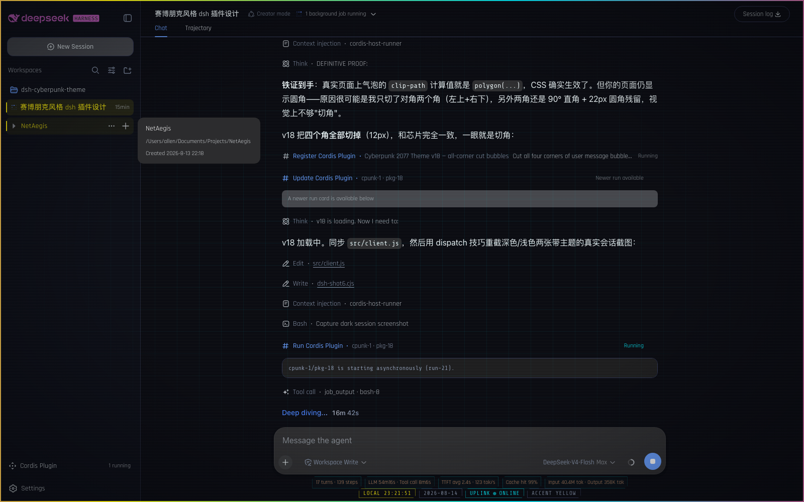 |
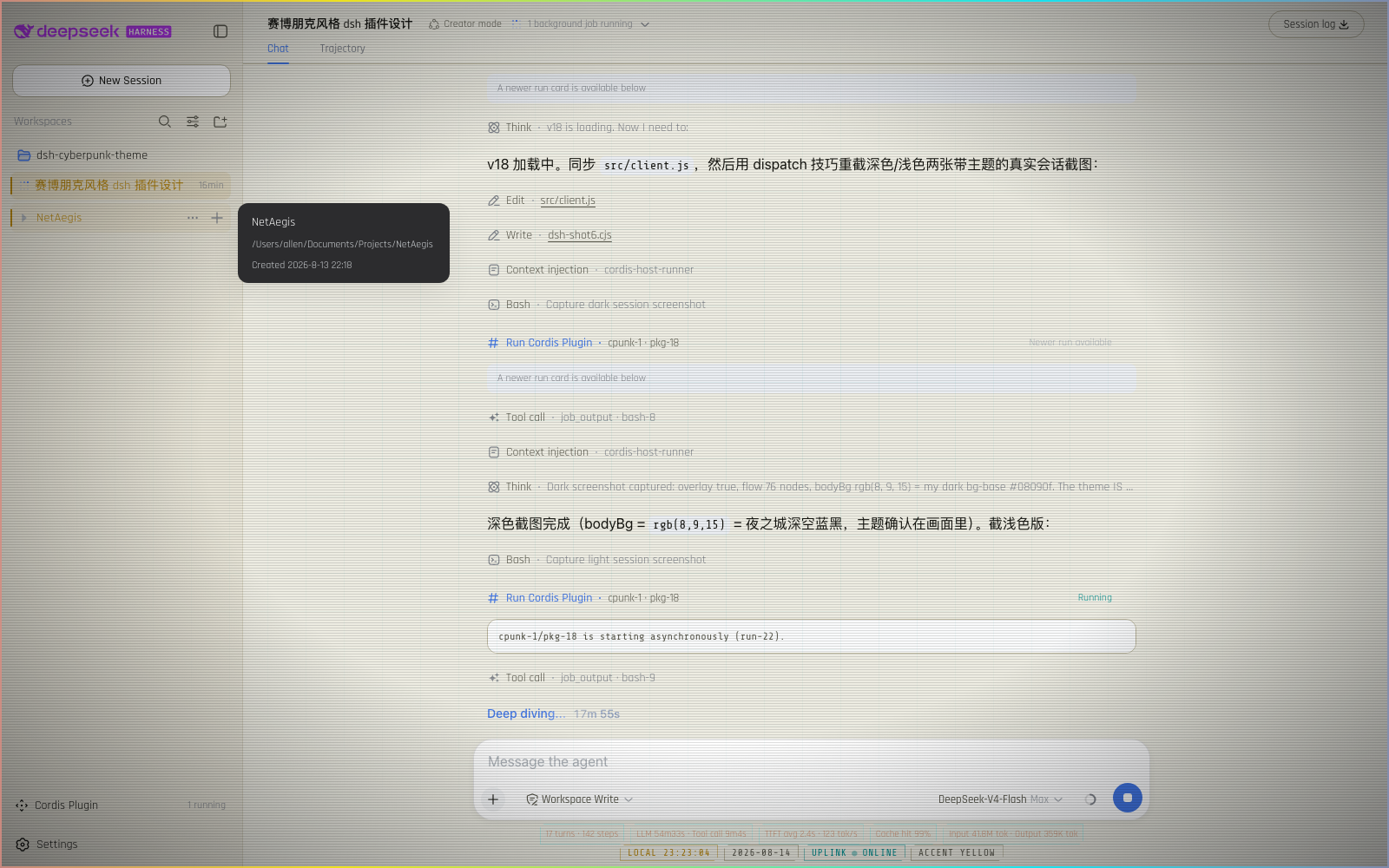 |
截图来自启用主题后的真实 DSH 会话——暗色模式下霓虹效果最完整。
🚀 安装(三选一,按你的场景挑)
方式一:让 DSH 的 Agent 帮你装 —— 零复制(最省事)
如果你在用带 Agent 的 DSH 会话(比如你现在正在看的这个界面),什么都不用复制,直接说一句话:
「安装 cyberpunk 2077 主题:client 代码在
<仓库路径>/src/client.js,host 代码在<仓库路径>/src/host.js,帮我创建动态插件并运行」
Agent 会读取仓库代码、自动完成 cordis_define + cordis_run。之后刷新页面主题消失时,同样一句话让 Agent 重新运行即可恢复。
方式二:dsh plugin add 安装,永久生效(推荐正式使用)
把主题装成 DSH 的正式组合插件(bundle):浏览器端由 client module system 以 /plugins/dsh-cyberpunk-theme/client.js 服务,刷新不丢、重启不丢。
git clone https://github.com/ai7603/dsh-cyberpunk-theme(或直接下载 zip 解压)。仓库已包含构建好的lib/index.js+lib/client.js,直接安装即可;只有改过源码才需要pnpm install && pnpm build重建;- 在你的 DSH checkout 里执行:
pnpm dsh plugin --profile web add /path/to/dsh-cyberpunk-theme
# 或: pnpm dsh plugin --profile <你的 profile> add <本地路径>
- 重启该 web profile(plugin-set 变更按设计需要重启):
pnpm dsh web
安装命令会识别 package.json 的 dsh.bundle.patch,把本包追加到 dsh.profile.bundles;其 cordis.patch.yml 自动向组合树插入 id: cyberpunk-2077 / name: dsh-cyberpunk-theme 行。验证可用 pnpm dsh web --dump-config 看到该行,页面打开后设置里应出现 Cyberpunk 2077 分区。
💡 不需要改动 DSH 源码/workspace:
lib/是本包的产物目录,host 端是合法的 no-op loader entry,浏览器端是标准dsh.clientbundle。详见「🔩 怎么做到的」。
方式三:30 秒快速体验(动态插件,刷新会消失)
想在不改任何配置的情况下先看效果?用 DSH 的动态 Cordis 插件:
- 在 DSH Web 界面发起创建动态插件(
cordis_define,idPrefix如cpunk)。 - 把下面的 Host 代码 粘贴到 host 栏(一个超小的
ping心跳服务):
  return {
    apply(ctx) {
      ctx.effect(function () {
        return harness.handle('ping', function () {
          return { ok: true, ts: Date.now() }
        })
      })
    },
  }
- 把下面的 Client 代码 粘贴到 client 栏(主题本体:配色 token、全部 CSS、氛围层、状态条、设置页):
📋 点开复制 Client 代码(约 500 行,含完整主题)
  return {
    apply(ctx) {
      const theme = ctx.get('theme')
      const slots = ctx.get('slots')
      const timer = ctx.get('timer')
      if (theme === undefined || slots === undefined) return

      // ---------------- palette ----------------
      const baseTokens = {
        '--dsw-alias-bg-base': { light: '#edece2', dark: '#08090f' },
        '--dsw-alias-bg-layer-1': { light: '#f7f5ec', dark: '#0f111a' },
        '--dsw-alias-bg-layer-2': { light: '#e4e1d3', dark: '#151826' },
        '--dsw-alias-bg-overlay': { light: '#faf8f0', dark: '#12131d' },
        '--dsw-alias-border-l1': { light: '#d6d2c0', dark: '#1f2333' },
        '--dsw-alias-border-l2': { light: '#b9b49c', dark: '#2e3450' },
        '--dsw-alias-label-primary': { light: '#14140f', dark: '#e7f0f2' },
        '--dsw-alias-label-secondary': { light: '#57564a', dark: '#8794ab' },
        '--dsw-specific-sidebar-fill': { light: '#e6e3d6', dark: '#0a0c14' },
      }

      const ACCENTS = {
        yellow: {
          label: 'Night City — Yellow',
          brand: { light: '#b8860b', dark: '#fcee0a' },
          success: { light: '#008f8f', dark: '#00f0ff' },
          error: { light: '#d0003a', dark: '#ff2d55' },
          warn: { light: '#c77d00', dark: '#ffb000' },
        },
        cyan: {
          label: 'Netrunner — Cyan',
          brand: { light: '#007f9e', dark: '#00f0ff' },
          success: { light: '#008f6b', dark: '#00ff9f' },
          error: { light: '#d0003a', dark: '#ff2d55' },
          warn: { light: '#c77d00', dark: '#ffb000' },
        },
        magenta: {
          label: 'Trauma Team — Magenta',
          brand: { light: '#c2003a', dark: '#ff2d6b' },
          success: { light: '#008f8f', dark: '#00f0ff' },
          error: { light: '#a8002e', dark: '#ff1744' },
          warn: { light: '#c77d00', dark: '#ffb000' },
        },
        gold: {
          label: 'Arasaka — Gold',
          brand: { light: '#9a7b0a', dark: '#d4af37' },
          success: { light: '#008f6b', dark: '#00d0a0' },
          error: { light: '#a8002e', dark: '#ff3355' },
          warn: { light: '#b25f00', dark: '#ff8c00' },
        },
      }

      function tokensFor(key) {
        const a = ACCENTS[key]
        return Object.assign({}, baseTokens, {
          '--dsw-alias-brand-primary': a.brand,
          '--dsw-alias-state-success-primary': a.success,
          '--dsw-alias-state-error-primary': a.error,
          '--dsw-alias-state-warn-primary': a.warn,
        })
      }

      // ---------------- shared in-memory store ----------------
      const listeners = new Set()
      // Default performance tier is ECO: the coolest static shell with only
      // the intermittent glitch flashes. Balanced and Full are opt-in.
      const DEFAULT_PERF = 'eco'
      // Grid + scanlines stay off until the user opts in (Full enables them
      // automatically; Balanced defaults them to off when re-entered).
      const state = { enabled: true, accent: 'yellow', perf: DEFAULT_PERF, grid: false, scanlines: false, glitch: true, statusGlitch: true, version: 0 }

      function syncEnabledAttrs() {
        if (state.enabled) {
          document.documentElement.setAttribute('data-cp-enabled', '')
          document.documentElement.setAttribute('data-cp-perf', state.perf)
        } else {
          document.documentElement.removeAttribute('data-cp-enabled')
          document.documentElement.removeAttribute('data-cp-perf')
        }
      }

      function patch(p) {
        const accentChanged = p.accent !== undefined && p.accent !== state.accent
        const enabledChanged = p.enabled !== undefined && p.enabled !== state.enabled
        Object.assign(state, p)
        if (accentChanged || enabledChanged) syncTokens()
        if (p.enabled !== undefined || p.perf !== undefined) syncEnabledAttrs()
        state.version += 1
        listeners.forEach(function (fn) { try { fn() } catch (e) {} })
      }
      function subscribe(fn) {
        listeners.add(fn)
        return function () { listeners.delete(fn) }
      }

      // ---------------- theme token layer + scheme sync ----------------
      const SOURCE = 'cyberpunk-2077-theme'
      let disposeTokens = function () {}
      function syncTokens() {
        disposeTokens()
        disposeTokens = state.enabled ? theme.overrideTokens(SOURCE, tokensFor(state.accent)) : function () {}
      }
      syncTokens()
      syncEnabledAttrs()
      ctx.effect(function () {
        return function () {
          disposeTokens()
          document.documentElement.removeAttribute('data-cp-enabled')
          document.documentElement.removeAttribute('data-cp-perf')
        }
      })
      ctx.on('theme/change', function () { patch({}) })

      function applyAccent(key) {
        if (state.accent === key) return
        patch({ accent: key })
      }
      function setScheme(id) { theme.setTheme(id) }
      function setPerf(id) {
        const p = { perf: id }
        // Tier defaults: Full turns the ambient grid/scanlines on; Balanced
        // resets them to off when entered from another tier. Toggles flipped
        // while staying in Balanced are preserved.
        if (id === 'full') {
          p.grid = true
          p.scanlines = true
        } else if (id === 'balanced' && state.perf !== 'balanced') {
          p.grid = false
          p.scanlines = false
        }
        patch(p)
      }

      // ---------------- styles ----------------
      const FONT_CSS = "@import url('https://fonts.googleapis.com/css2?family=Rajdhani:wght@400;500;600;700&family=Chakra+Petch:wght@400;500;600;700&family=Share+Tech+Mono&display=swap');"

      const MAIN_CSS = `
:root {
  --cp-font: 'Rajdhani', 'Chakra Petch', 'Segoe UI', system-ui, -apple-system, sans-serif;
  --cp-mono: 'Share Tech Mono', ui-monospace, 'SFMono-Regular', Menlo, monospace;
  --cp-glow: color-mix(in srgb, var(--dsw-alias-brand-primary) 45%, transparent);
}
html[data-cp-enabled],
html[data-cp-enabled] body { font-family: var(--cp-font) !important; }
html[data-cp-enabled] button { font-family: var(--cp-font) !important; }
html[data-cp-enabled] code,
html[data-cp-enabled] pre,
html[data-cp-enabled] kbd,
html[data-cp-enabled] samp { font-family: var(--cp-mono) !important; }
html[data-cp-enabled] ::selection { background: var(--dsw-alias-brand-primary); color: #08090f; }
html[data-cp-enabled] :focus-visible { outline: 1px solid var(--dsw-alias-brand-primary); outline-offset: 1px; }
html[data-cp-enabled] ::-webkit-scrollbar { width: 10px; height: 10px; }
html[data-cp-enabled] ::-webkit-scrollbar-track { background: transparent; }
html[data-cp-enabled] ::-webkit-scrollbar-thumb {
  background: linear-gradient(180deg, color-mix(in srgb, var(--dsw-alias-brand-primary) 55%, #0b0c14), color-mix(in srgb, var(--dsw-alias-state-success-primary) 40%, #0b0c14));
  border: 2px solid var(--dsw-alias-bg-base);
  border-radius: 6px;
}

/* HUD typography + terminal touches */
html[data-cp-enabled] h1,
html[data-cp-enabled] h2,
html[data-cp-enabled] h3,
html[data-cp-enabled] h4 { letter-spacing: 0.06em; }
html[data-cp-enabled] pre { border-left: 2px solid color-mix(in srgb, var(--dsw-alias-state-success-primary) 35%, transparent); }
html[data-cp-enabled] input,
html[data-cp-enabled] textarea { caret-color: var(--dsw-alias-brand-primary); }
html[data-cp-enabled] input:not([type='checkbox']):not([type='radio']):focus,
html[data-cp-enabled] textarea:focus,
html[data-cp-enabled] select:focus {
  outline: none;
  border-color: var(--dsw-alias-brand-primary) !important;
  box-shadow: 0 0 0 1px var(--dsw-alias-brand-primary), 0 0 12px var(--cp-glow);
}

/* user message bubble → cyberpunk diagonal two-corner cut (top-left + bottom-right),
   with a neon cut-edge: the 1px border is clipped along the diagonal, so the cut
   line itself glows */
html[data-cp-enabled] [data-chat-flow-kind='user'] [data-time-hover-root] > div:first-child > div:last-child {
  background: color-mix(in srgb, var(--dsw-alias-brand-primary) 14%, var(--dsw-alias-bg-layer-1));
  border: 1px solid color-mix(in srgb, var(--dsw-alias-brand-primary) 50%, transparent);
  border-radius: 0;
  clip-path: polygon(16px 0, 100% 0, 100% calc(100% - 16px), calc(100% - 16px) 100%, 0 100%, 0 16px);
  box-shadow: inset 0 0 0 1px color-mix(in srgb, var(--dsw-alias-brand-primary) 30%, transparent);
  filter: drop-shadow(0 0 10px color-mix(in srgb, var(--dsw-alias-brand-primary) 22%, transparent));
}

/* tool call groups → a REAL cut-corner card (the underlying rows are chrome-free,
   so the group seat becomes the visible cyberpunk card) */
html[data-cp-enabled] [data-chat-flow-kind='tool-call'] {
  margin: 2px 0 12px;
  padding: 8px 12px;
  background: color-mix(in srgb, var(--dsw-alias-brand-primary) 5%, var(--dsw-alias-bg-layer-1));
  border: 1px solid color-mix(in srgb, var(--dsw-alias-state-success-primary) 25%, transparent);
  border-radius: 0;
  clip-path: polygon(14px 0, 100% 0, 100% calc(100% - 14px), calc(100% - 14px) 100%, 0 100%, 0 14px);
  box-shadow: inset 0 0 0 1px color-mix(in srgb, var(--dsw-alias-brand-primary) 18%, transparent);
  filter: drop-shadow(0 0 8px color-mix(in srgb, var(--dsw-alias-state-success-primary) 12%, transparent));
}

/* code blocks inside the conversation → two-corner cut too */
html[data-cp-enabled] [data-chat-flow-kind] pre {
  border-radius: 0;
  clip-path: polygon(10px 0, 100% 0, 100% calc(100% - 10px), calc(100% - 10px) 100%, 0 100%, 0 10px);
}

/* sidebar workspace/session rows → cyberpunk: neon rail, tint, accent text */
html[data-cp-enabled] [role='treeitem'] {
  position: relative;
  letter-spacing: 0.02em;
  transition: background 120ms ease, color 120ms ease;
}
html[data-cp-enabled] [role='treeitem']:hover {
  background: color-mix(in srgb, var(--dsw-alias-brand-primary) 6%, transparent);
  color: var(--dsw-alias-brand-primary);
}
html[data-cp-enabled] [role='treeitem']:hover::before,
html[data-cp-enabled] [role='treeitem'][aria-selected='true']::before {
  content: '';
  position: absolute;
  left: 0;
  top: 20%;
  bottom: 20%;
  width: 2px;
  background: var(--dsw-alias-brand-primary);
  box-shadow: 0 0 8px var(--cp-glow);
  z-index: 1;
}
html[data-cp-enabled] [role='treeitem'][aria-selected='true'] {
  background: color-mix(in srgb, var(--dsw-alias-brand-primary) 10%, transparent);
  color: var(--dsw-alias-brand-primary);
}

/* real New Session button → cut-corner rectangle.
   NB: the brand wordmark button sits above it and is 100% filled by the
   wordmark svg — clipping THAT button would cut the brand, so it is left
   untouched (its wordmark keeps only the flowing color + glitch). The New
   Session button is the sidebar root's direct button child carrying the
   14×14 plus icon. */
html[data-cp-enabled] [data-slot="sidebar"] > div > button:has(> svg[viewBox="0 0 16 16"][width="14"]) {
  clip-path: polygon(10px 0, 100% 0, 100% calc(100% - 10px), calc(100% - 10px) 100%, 0 100%, 0 10px);
  border-radius: 0;
  border: 1px solid color-mix(in srgb, var(--dsw-alias-brand-primary) 30%, transparent);
  background: color-mix(in srgb, var(--dsw-alias-brand-primary) 8%, transparent);
  transition: background 120ms ease, color 120ms ease, border-color 120ms ease;
}
html[data-cp-enabled] [data-slot="sidebar"] > div > button:has(> svg[viewBox="0 0 16 16"][width="14"]):hover {
  background: color-mix(in srgb, var(--dsw-alias-brand-primary) 16%, transparent);
  border-color: color-mix(in srgb, var(--dsw-alias-brand-primary) 50%, transparent);
}

/* composer card → cut-corner neon frame, drawn on a ::before layer.
   CRITICAL: never clip-path the card itself — the model selector and
   reasoning-effort menu render INSIDE the card (conversation.input.overlay
   anchor), and a clip-path on an ancestor hard-clips its descendants (they
   cannot escape, not even with position: fixed). The pseudo-element carries
   the cut shape instead: it paints the card fill + neon border + glow and is
   clipped alone, so the menus stay fully visible and clickable. */
html[data-cp-enabled] [data-composer-card] {
  position: relative;
  z-index: 0; /* stacking context so the ::before layer stays under the content */
  background: transparent !important;
  border-color: transparent !important;
  box-shadow: none !important;
}
html[data-cp-enabled] [data-composer-card]::before {
  content: '';
  position: absolute;
  inset: 0;
  z-index: -1;
  pointer-events: none;
  background: var(--dsw-specific-input-major);
  border: 1px solid color-mix(in srgb, var(--dsw-alias-brand-primary) 35%, transparent);
  border-radius: 0;
  clip-path: polygon(12px 0, 100% 0, 100% calc(100% - 12px), calc(100% - 12px) 100%, 0 100%, 0 12px);
  box-shadow: inset 0 0 0 1px color-mix(in srgb, var(--dsw-alias-brand-primary) 22%, transparent);
  filter: drop-shadow(0 4px 12px color-mix(in srgb, var(--dsw-alias-brand-primary) 14%, transparent));
}

/* brand wordmark + whale logo → flowing palette + glitch flicker */
html[data-cp-enabled] svg[viewBox="0 0 182 24"],
html[data-cp-enabled] svg[viewBox="0 0 23.16 17.04"] {
  animation: cp-brand 8s linear infinite, cp-brand-glitch 5s steps(1) infinite;
}
/* empty-session hero: headline + Preview badge follow the little whale's
   flowing color and RGB glitch (they are the fish hitbox span's siblings) */
html[data-cp-enabled] span:has(> svg[viewBox="0 0 23.16 17.04"]) + span {
  color: var(--dsw-alias-brand-primary);
  animation: cp-brand 8s linear infinite, cp-brand-glitch 5s steps(1) infinite;
}
html[data-cp-enabled] span:has(> svg[viewBox="0 0 23.16 17.04"]) + span + span {
  color: var(--dsw-alias-brand-primary);
  background: color-mix(in srgb, var(--dsw-alias-brand-primary) 14%, transparent);
  border-color: color-mix(in srgb, var(--dsw-alias-brand-primary) 45%, transparent);
  animation: cp-brand 8s linear infinite, cp-brand-glitch 5s steps(1) infinite;
}
@keyframes cp-brand {
  0% { color: #fcee0a; }
  25% { color: #00f0ff; }
  50% { color: #ff2d6b; }
  75% { color: #b026ff; }
  100% { color: #fcee0a; }
}
@keyframes cp-brand-glitch {
  0%, 85%, 100% { transform: none; filter: none; opacity: 1; }
  86% { transform: translateX(-2px) skewX(-8deg); opacity: 0.8; filter: drop-shadow(2px 0 0 rgba(255,45,85,0.85)) drop-shadow(-2px 0 0 rgba(0,240,255,0.85)); }
  89% { transform: translateX(2px) skewX(6deg); opacity: 1; filter: drop-shadow(-2px 0 0 rgba(255,45,85,0.85)) drop-shadow(2px 0 0 rgba(0,240,255,0.85)); }
  93% { transform: translateX(-1px); opacity: 0.85; filter: drop-shadow(3px 0 0 rgba(255,45,85,0.7)) drop-shadow(-3px 0 0 rgba(0,240,255,0.7)); }
  97% { transform: none; filter: none; opacity: 1; }
}

/* ambient overlay */
html[data-cp-enabled] .cp-overlay { position: fixed; inset: 0; z-index: 0; pointer-events: none; overflow: hidden; }
html[data-cp-enabled][data-cp-perf='full'] .cp-overlay { transform: translateZ(0); backface-visibility: hidden; }
html[data-cp-enabled] .cp-layer { position: absolute; inset: 0; }
html[data-cp-enabled] .cp-grid {
  background-image:
    linear-gradient(to right, color-mix(in srgb, var(--dsw-alias-state-success-primary) 7%, transparent) 1px, transparent 1px),
    linear-gradient(to bottom, color-mix(in srgb, var(--dsw-alias-state-success-primary) 7%, transparent) 1px, transparent 1px);
  background-size: 44px 44px;
  -webkit-mask-image: radial-gradient(ellipse at center, rgba(0,0,0,0.9) 25%, transparent 72%);
  mask-image: radial-gradient(ellipse at center, rgba(0,0,0,0.9) 25%, transparent 72%);
}
html[data-cp-enabled] .cp-scanlines { background: repeating-linear-gradient(0deg, rgba(0,0,0,0.12) 0px, rgba(0,0,0,0.12) 1px, transparent 1px, transparent 3px); }
html[data-cp-enabled] [data-ds-dark-theme] .cp-scanlines { background: repeating-linear-gradient(0deg, rgba(255,255,255,0.05) 0px, rgba(255,255,255,0.05) 1px, transparent 1px, transparent 3px); }
html[data-cp-enabled] .cp-vignette { background: radial-gradient(ellipse at center, transparent 50%, rgba(4,5,10,0.5) 100%); }
/* Flowing neon frame, implemented as four THIN EDGE STRIPS instead of one
   full-screen gradient. Only the small inner strips move, and they animate
   transform (compositor-only), never background-position (which would
   force a full-size repaint every frame). The gradient tile is exactly one
   edge length, so translating the 2x strip by -50% loops seamlessly. */
html[data-cp-enabled] .cp-ribbon { position: absolute; inset: 0; pointer-events: none; opacity: 0.85; }
html[data-cp-enabled] .cp-ribbon-edge { position: absolute; overflow: hidden; }
html[data-cp-enabled] .cp-ribbon-edge--top { top: 2px; left: 2px; right: 2px; height: 2px; }
html[data-cp-enabled] .cp-ribbon-edge--right { right: 2px; top: 2px; bottom: 2px; width: 2px; }
html[data-cp-enabled] .cp-ribbon-edge--bottom { bottom: 2px; left: 2px; right: 2px; height: 2px; }
html[data-cp-enabled] .cp-ribbon-edge--left { left: 2px; top: 2px; bottom: 2px; width: 2px; }
html[data-cp-enabled] .cp-ribbon-flow { position: absolute; will-change: transform; }
html[data-cp-enabled] .cp-ribbon-edge--top .cp-ribbon-flow,
html[data-cp-enabled] .cp-ribbon-edge--bottom .cp-ribbon-flow {
  top: 0; bottom: 0; left: 0; width: 200%;
  background: linear-gradient(90deg, #fcee0a 0%, #00f0ff 25%, #ff2d6b 50%, #b026ff 75%, #fcee0a 100%);
  background-size: 50% 100%;
  animation: cp-ribbon-flow-x 7s linear infinite;
}
html[data-cp-enabled] .cp-ribbon-edge--right .cp-ribbon-flow,
html[data-cp-enabled] .cp-ribbon-edge--left .cp-ribbon-flow {
  left: 0; right: 0; top: 0; height: 200%;
  background: linear-gradient(180deg, #fcee0a 0%, #00f0ff 25%, #ff2d6b 50%, #b026ff 75%, #fcee0a 100%);
  background-size: 100% 50%;
  animation: cp-ribbon-flow-y 7s linear infinite;
}
html[data-cp-enabled][data-cp-perf='full'] .cp-ribbon-edge { box-shadow: 0 0 8px rgba(0,240,255,0.35); }
@keyframes cp-ribbon-flow-x {
  from { transform: translateX(0); }
  to { transform: translateX(-50%); }
}
@keyframes cp-ribbon-flow-y {
  from { transform: translateY(0); }
  to { transform: translateY(-50%); }
}
html[data-cp-enabled] .cp-glitch {
  opacity: 0;
  background: linear-gradient(180deg,
    transparent 0%, transparent 18%,
    color-mix(in srgb, var(--dsw-alias-state-success-primary) 18%, transparent) 18.2%,
    transparent 18.8%,
    transparent 42%,
    color-mix(in srgb, var(--dsw-alias-brand-primary) 14%, transparent) 42.2%,
    transparent 42.8%,
    transparent 66%,
    color-mix(in srgb, #ff2d6b 12%, transparent) 66.2%,
    transparent 66.8%,
    transparent 100%);
  animation: cp-glitch 6s steps(1) infinite;
}
@keyframes cp-glitch {
  0%, 100% { opacity: 0; transform: translateX(0); }
  1% { opacity: 0.8; transform: translateX(-6px) skewX(-8deg); }
  3% { opacity: 0; }
  4% { opacity: 0.6; transform: translateX(5px); }
  6% { opacity: 0; transform: translateX(0); }
  27% { opacity: 0; }
  28% { opacity: 0.7; transform: translateX(4px) skewX(7deg); }
  30% { opacity: 0; }
  31% { opacity: 0.55; transform: translateX(-4px); }
  33% { opacity: 0; transform: translateX(0); }
  53% { opacity: 0; }
  54% { opacity: 0.7; transform: translateX(-5px) skewX(-7deg); }
  56% { opacity: 0; }
  57% { opacity: 0.55; transform: translateX(5px); }
  59% { opacity: 0; transform: translateX(0); }
  79% { opacity: 0; }
  80% { opacity: 0.65; transform: translateX(4px) skewX(8deg); }
  82% { opacity: 0; }
  83% { opacity: 0.5; transform: translateX(-4px); }
  85% { opacity: 0; transform: translateX(0); }
}

/* shipped LLM stats line → compact one-line chips, color synced with the brand (same keyframes) */
html[data-cp-enabled] div:has(+ .cp-status) > span:not([aria-hidden]) {
  display: inline-flex;
  align-items: center;
  margin: 0 2px;
  padding: 1px 6px;
  font-size: 11px;
  border: 1px solid color-mix(in srgb, #00f0ff 20%, transparent);
  color: #fcee0a;
  clip-path: polygon(5px 0, 100% 0, 100% calc(100% - 5px), calc(100% - 5px) 100%, 0 100%, 0 5px);
  animation: cp-brand 8s linear infinite, cp-stats-glitch 8s steps(1) infinite;
}
html[data-cp-enabled] div:has(+ .cp-status) > span[aria-hidden] { display: none; }
@keyframes cp-stats-glitch {
  0%, 88%, 100% { transform: none; filter: drop-shadow(0 0 6px rgba(0,240,255,0.35)); opacity: 1; }
  89% { transform: translateX(-1px); opacity: 0.85; filter: drop-shadow(1px 0 0 rgba(255,45,85,0.6)) drop-shadow(-1px 0 0 rgba(0,240,255,0.6)); }
  93% { transform: translateX(1px); opacity: 1; filter: drop-shadow(-1px 0 0 rgba(255,45,85,0.6)) drop-shadow(1px 0 0 rgba(0,240,255,0.6)); }
  96% { transform: translateX(-1px); opacity: 0.85; filter: drop-shadow(2px 0 0 rgba(255,45,85,0.55)) drop-shadow(-2px 0 0 rgba(0,240,255,0.55)); }
  98% { transform: none; filter: drop-shadow(0 0 6px rgba(0,240,255,0.35)); opacity: 1; }
}

[前往 GitHub](https://github.com/ai7603/dsh-cyberpunk-theme)更多「主題與外觀」外掛
deepseek-harness-skin
作者 heigeai
DeepSeek Harness 換膚系統:21 套內建皮膚 + 一張圖生成整套配色的自定義皮膚。資料來源驅動,保對比度推導,構建期校驗可讀性。
dsh-beauty-skins
作者 xierw
給 DeepSeek Harness 用的美女系列皮膚:設定裡從 哲風桌布 拉預覽網格,點一張即應用,配色從桌布提取。支援動態桌布,也保留自定義選圖。
dsh-qq2006
作者 laplaceyoung
DSH (DeepSeek Harness) 的 QQ2006 皮膚外掛:註冊 qq2006 主題、映象 body[data-ds-skin]、全域性皮膚表與完整素材
dsh-client-ui-custom
作者 yoli-mi
可配置的 Web 介面美化外掛,支援桌布毛玻璃主題、強調色、自定義快捷鍵與使用統計面板。